XCP-ng
    • Categories
    • Recent
    • Tags
    • Popular
    • Users
    • Groups
    • Register
    • Login

    New project - XenAdminQt - a cross-platform GNU/Linux, macOS, Windows native thick client
    Scheduled Pinned Locked Moved News
    65 Posts 8 Posters 18.4k Views 12 Watching
    Loading More Posts
    • Oldest to Newest
    • Newest to Oldest
    • Most Votes
    Reply
    • Reply as topic
    Log in to reply
    This topic has been deleted. Only users with topic management privileges can see it.
    • bvitnikB
      bvitnik @benapetr
      last edited by

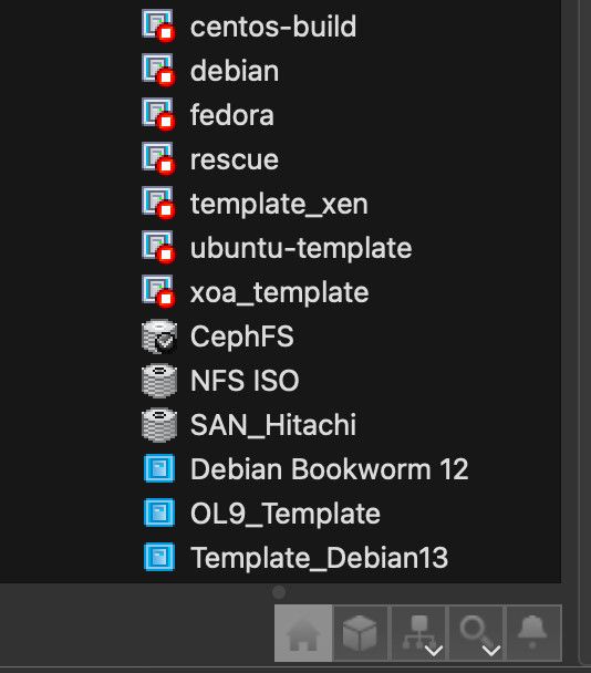
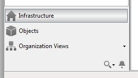
      @benapetr The thing @clip is talking about is when the bottom panel (under the tree) is resized vertically, or better said squished vertically, the elements of the list (Infrastructure, Objects...) get replaced by a single horizontal icon at the bottom, one by one:

      image.jpeg

      and even more

      image.jpeg

      B 2 Replies Last reply
      Reply Quote 0
      • B
        benapetr @bvitnik
        last edited by

        @bvitnik ok that's cool, didn't know it could do that

        1 Reply Last reply
        Reply Quote 0
        • B
          benapetr @bvitnik
          last edited by

          @bvitnik it's implemented as well

          B 1 Reply Last reply
          Reply Quote 0
          • B
            benapetr @benapetr
            last edited by

            that horizontal scroll bar was also enabled

            C bvitnikB 2 Replies Last reply
            Reply Quote 0
            • C
              clip @benapetr
              last edited by

              @benapetr That's fantastic - thank you!

              Thanks @bvitnik for the better screenshots 🙂 .

              1 Reply Last reply
              Reply Quote 0
              • bvitnikB
                bvitnik @benapetr
                last edited by bvitnik

                @benapetr Here are some more bugs:

                • Templates are still not sorted correctly in the tree view. User templates (blue) should go first then built in ones (yellow). Each group should be sorted alpabetically (see the screenshot).
                • Icons are back for categories (under the tree view) but elements should be left aligned. They look ugly when centered (screenshot).
                • Categories are still not collapsable to a single icon like shown in previous screenshots.
                • With the addition of horizontal scrollbar, there seems to be an ugly regression in tree view itself. The tree view is refreshed each 30 sec but while doing so, the tree is collapsed and then expanded. It's a little bit hard to explain but the tree just "jumps" in front of the eyes. This is particularly annoying while doing something in the tree view.
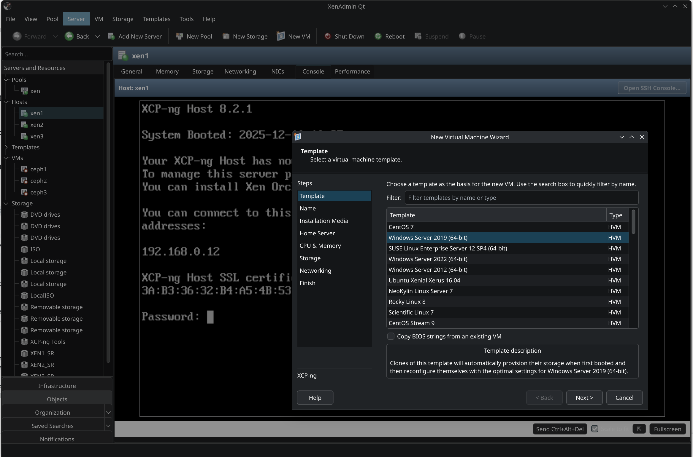
                • The New VM dialog, template selection section, now seems to be functionally identical, not visually though.
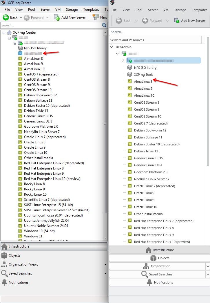
                image.jpeg

                B 1 Reply Last reply
                Reply Quote 0
                • B
                  benapetr @bvitnik
                  last edited by

                  @bvitnik I think you must be running some older clone, did you try to git pull recently? most of those issues were already fixed, only the sorting issue remains

                  B 1 Reply Last reply
                  Reply Quote 0
                  • B
                    benapetr @benapetr
                    last edited by

                    this is how it looks on my mac in latest version:
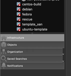
                    image.jpeg

                    image.jpeg

                    bvitnikB 1 Reply Last reply
                    Reply Quote 0
                    • bvitnikB
                      bvitnik @benapetr
                      last edited by bvitnik

                      @benapetr Yep. My message is based on 2 days old commit. I've compiled the latest one and the list at the bottom is collapsable now. I don't see the down arrow on "Organization" and "Saved searches" icons though like in your screenshot:

                      image.jpeg

                      The next few things:

                      • Saved searches is empty. By default, there are some useful built in saved searches.
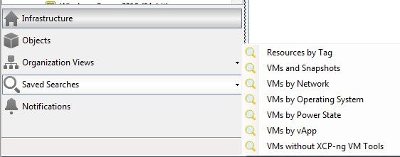
                      image.jpeg

                      • When you select a pool, on the info panel to the right the "Default SR" shows an OpaqRef instead of SR name. Reference should be dereferenced.
                      • A little bit nitpicking. Vertical spacing of the elements in the tree view is a little bit higher compared to xenadmin. It could be made smaller to pack more stuff on the screen but this is just visual preference.
                      C 1 Reply Last reply
                      Reply Quote 0
                      • C
                        clip @bvitnik
                        last edited by

                        @benapetr @bvitnik Yeah, saving (even vertical) screen real estate is always a good thing - at least having the option (as it means more is visually and functionally available at a glance - at the same time).

                        1 Reply Last reply
                        Reply Quote 0

                        Hello! It looks like you're interested in this conversation, but you don't have an account yet.

                        Getting fed up of having to scroll through the same posts each visit? When you register for an account, you'll always come back to exactly where you were before, and choose to be notified of new replies (either via email, or push notification). You'll also be able to save bookmarks and upvote posts to show your appreciation to other community members.

                        With your input, this post could be even better 💗

                        Register Login
                        • First post
                          Last post