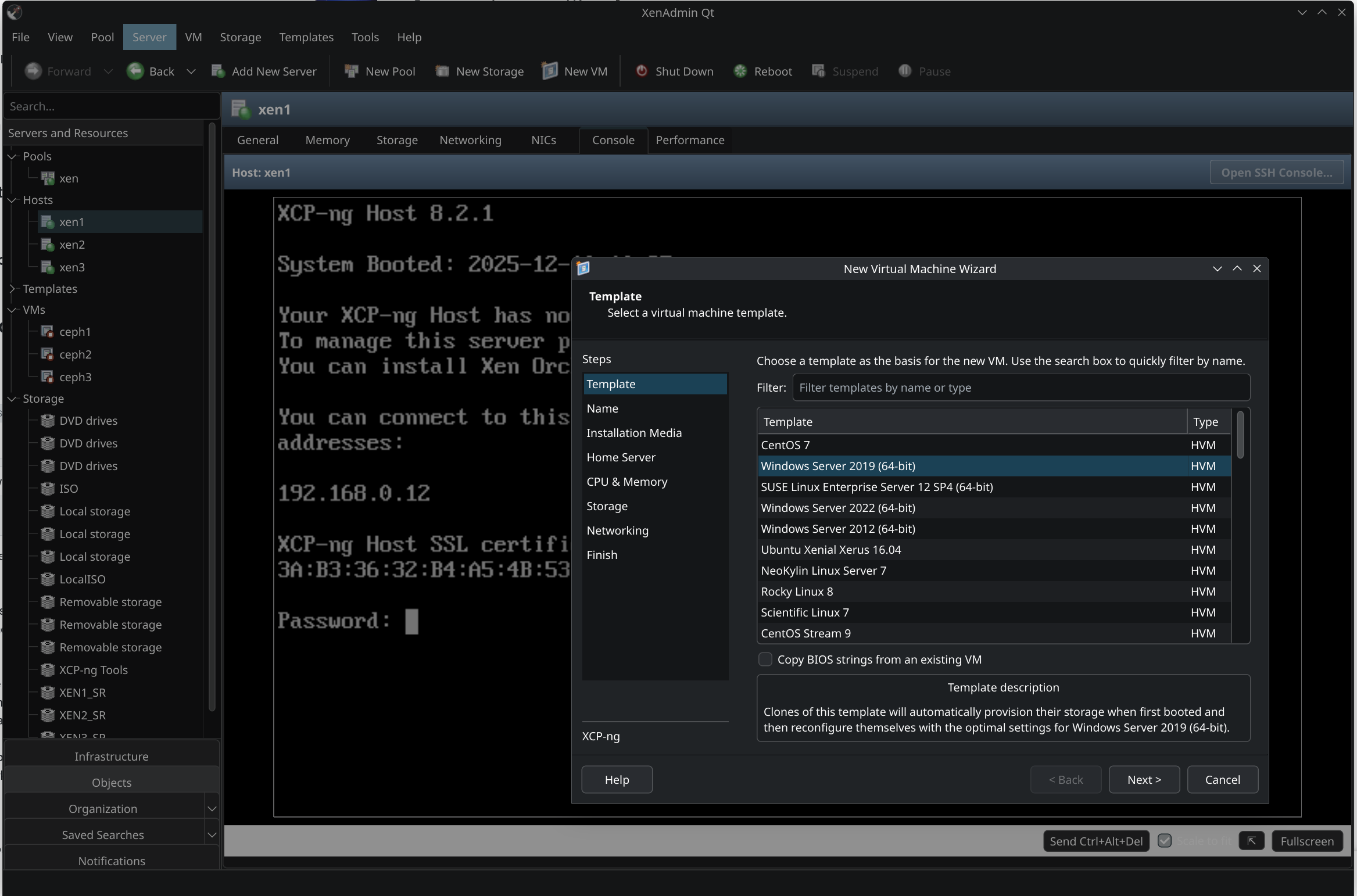
New project - XenAdminQt - a cross-platform GNU/Linux, macOS, Windows native thick client
-
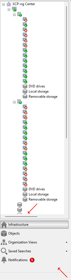
@benapetr In case it's helpful, two other quality of life things I noticed are that there is not yet a horizontal scroll bar available in the tree view (which is helpful when there are longer names and one wants to preserve screen real-estate) and that there is no way yet to compress the categories under the tree view into one horizontal line of icons (in order to save vertical space and see more of the tree view at once - as in xenadmin).
Redacted screenshot below (though not showing the 'compressed' icons).
-
@clip Horizontal scrollbar is trivial I will add it if it's really missing (I thought it's already there?) but regarding "compressing" I have no idea what do you mean, I didn't even know there is such a feature, will need to boot some windows VM to check it out
-
-
@bvitnik ok that's cool, didn't know it could do that
-
@bvitnik it's implemented as well
-
that horizontal scroll bar was also enabled
-
-
@benapetr Here are some more bugs:
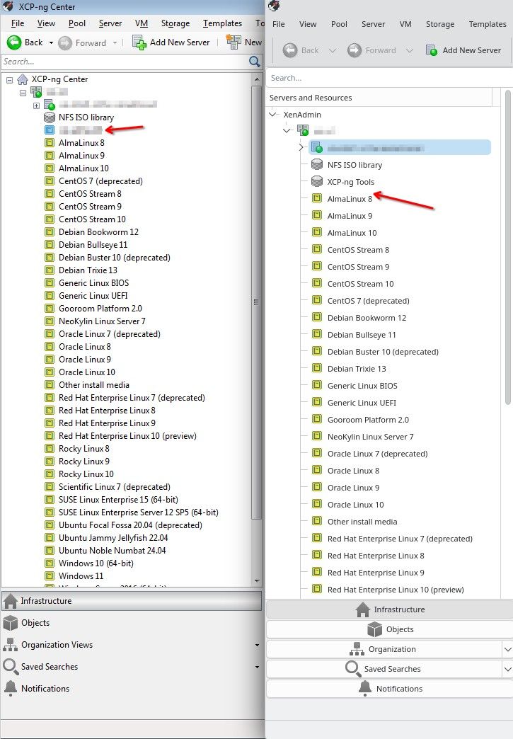
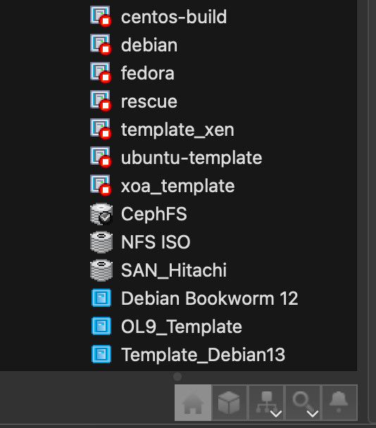
- Templates are still not sorted correctly in the tree view. User templates (blue) should go first then built in ones (yellow). Each group should be sorted alpabetically (see the screenshot).
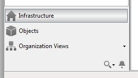
- Icons are back for categories (under the tree view) but elements should be left aligned. They look ugly when centered (screenshot).
- Categories are still not collapsable to a single icon like shown in previous screenshots.
- With the addition of horizontal scrollbar, there seems to be an ugly regression in tree view itself. The tree view is refreshed each 30 sec but while doing so, the tree is collapsed and then expanded. It's a little bit hard to explain but the tree just "jumps" in front of the eyes. This is particularly annoying while doing something in the tree view.
- The New VM dialog, template selection section, now seems to be functionally identical, not visually though.
-
@bvitnik I think you must be running some older clone, did you try to git pull recently? most of those issues were already fixed, only the sorting issue remains
-
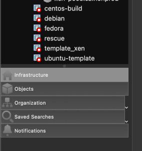
this is how it looks on my mac in latest version:


 .
Hello! It looks like you're interested in this conversation, but you don't have an account yet.
Getting fed up of having to scroll through the same posts each visit? When you register for an account, you'll always come back to exactly where you were before, and choose to be notified of new replies (either via email, or push notification). You'll also be able to save bookmarks and upvote posts to show your appreciation to other community members.
With your input, this post could be even better 💗
Register Login