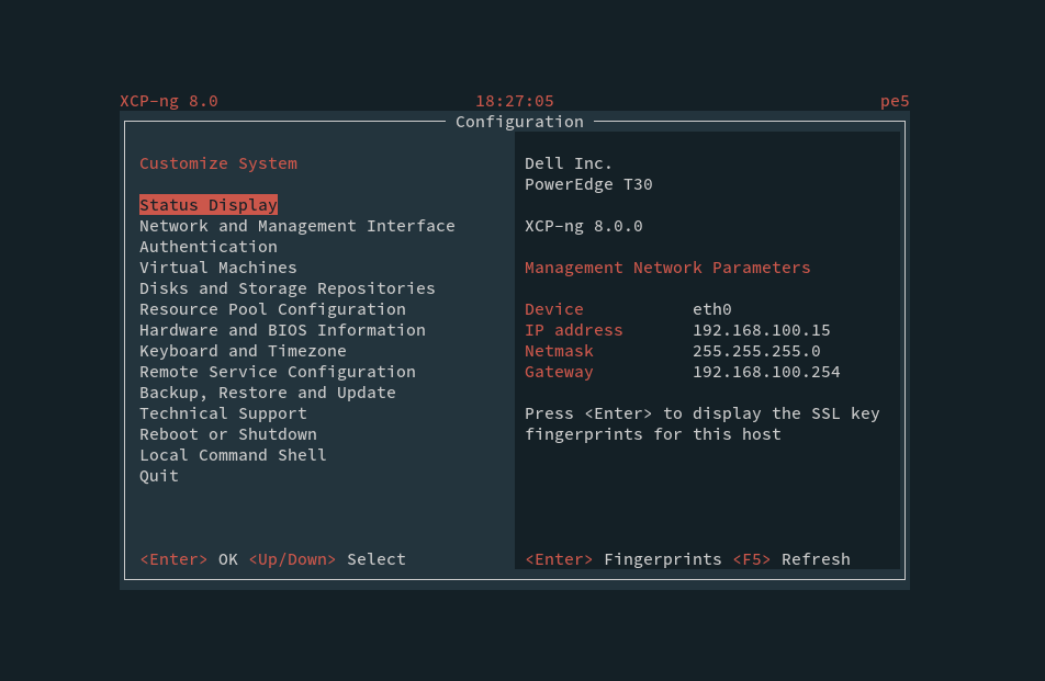
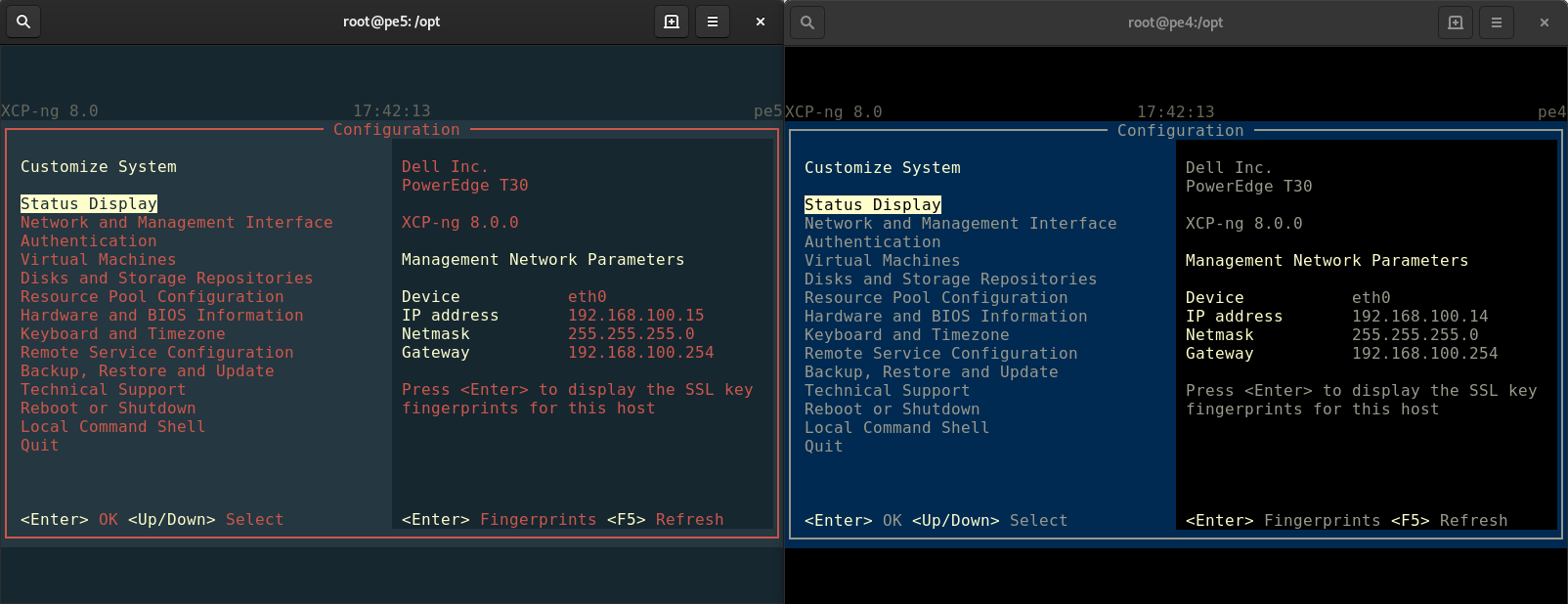
New XCP-ng "theme" in shell
-
Yeah despite
xsconsoleis far from being the main entry point to manage XS/XCP-ng, it seems people are very touchy about changing anything there
-
little off-top, any one know how to prevent status screen from going blank? I would like to see those information all the time
-
Less yellowish terminal to use less different colors and keeping the variations in the logo:

-
@akurzawa maybe try
setterm -blank 0 -powerdown 0but I have no idea if it will work. -
@olivierlambert I like this one the best so far. I like how there is a lot less red, but still some there.
-
I can't believe this is even a thing. How much time are people spending on this screen?! lol
-
@snowstruk I think it's the best balance between making a "brand" on XCP-ng and usability.
But as @bnrstnr suggest, yeah I'm still surprised there is so much debate on it for something nobody use a lot (I mean, who's really using this UI to do operations outside reboot or read IP address?)
-
@olivierlambert It just shows that people are passionate about this project.
In the end you cannot make everyone happy, but since you are seeking feedback I will provide my 2 cents.
-
Indeed
 And the feedback reduced the amount of "red", for the best I suppose. Constructive criticism is always good
-
I like the last result!
-
@olivierlambert said in New XCP-ng "theme" in shell:
(I mean, who's really using this UI to do operations outside reboot or read IP address?)
Me is.
-
Feel free to explain your use cases, I'm interested

-
Users of the 8.0.0 beta can now update and will get the new prompt and new console.
-
@olivierlambert said in New XCP-ng "theme" in shell:
Feel free to explain your use cases, I'm interested

To observe Host Performance Information, VMs' performance info, stop and start VMs, especially before and after a host reboot.
Especially being in the server room. There I use a physical console with a keyboard/video switch, not a workstation with a browser. Also, while working in a server room I don't seat near the display all the time and I must have a look from a side or from a larger distance.
Besides, it's usually faster for me to ssh somewhere than to make a series of tunnels to access the destination with a browser or XCP-ng Center. So also when ssh-ing, xsconsole is handy.
Having a legible xsconsole is important for me.
Especially on some new host, on which xsconsole use only a small fraction of the physical display and the characters are very small.
Do you know how I can configure Dom0 to have normal tty with 24 rows and 80 columns, so that xsconsole occupy all the physical display?
-
OK, but why not using
xeCLI? I mean, it's faster and you can get exactly what you need without moving the cursor in ncurse info?Regarding the size, feel free to take a look at the source, it's written in Python
 https://github.com/xenserver/xsconsole
 -
@olivierlambert said in New XCP-ng "theme" in shell:
OK, but why not using
xeCLI?Sometimes I use xe, sometimes XCP-ng Center, sometimes xsconsole.
I mean, it's faster and you can get exactly what you need without moving the cursor in ncurse info?
Typing tens of characters is not faster than pressing a few keys (like arrow, arrow, enter).
Especially standing at a not familiar keyboard in a server room.Regarding the size, feel free to take a look at the source, it's written in Python
 https://github.com/xenserver/xsconsole
This question is not only pertaining xsconsole.
I tried various things, but the most what I achieved was during the boot phase. After this, the CLI resolution reverts to very small characters again

-
Unless it's an environmental decision to make the xsconsole as dim and washed out as possible, to save power, my humble suggestion would be to multiply the fgBright values by 1.249 to get 999,431,372, if my math is correct, and set fgNormal to something like 930,930,930
fgDark could either remain at its current values or be set to fbBright
-
Feel free to try on your install and use screenshot to show the diff

-
I did do it on my install, that's why I'm suggesting it.
The default values made me thing I had a semi-transparent film all over my display.My install is on a physical machine (a laptop) so I don't know how I'd take a proper screenshot.
I don't think a phone photo would show the difference. -
@olivierlambert I think this is probably the most sensible of the schemas so far.
The dark background reduces glare, text is high-contrast, and the red actually draws the eye as a highlight or accent color. Looks sharp!


