New XCP-ng "theme" in shell
-
For XCP-ng 8 we thought that it might be interesting to get a dedicated visual identity outside the boot splash: the prompt and the "ncurse" display.
A new prompt
- removed the current user (because it's an "appliance", with only
root - added current time, very handy to know how long your command took (eg export)
- using XCP-ng colors
New vs old:

Obviously, we got a fallback for terminal without color support.
Also, it also works on white background terms:

A new console theme (xsconsole)
New vs old:
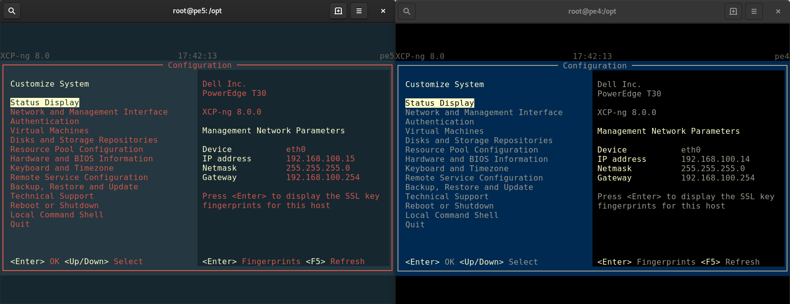
There is also a fallback on terminals without color support (unchanged)
Maybe you could think it's a minor thing, but in the end, that's how we show XCP-ng is not just a clone of CH/XS

Obviously, you can still configure this easily (especially the prompt, because you can override it).
What do you think?
- removed the current user (because it's an "appliance", with only
-
@olivierlambert said in New XCP-ng "theme" in shell:
For XCP-ng 8 we thought that it might be interesting to get a dedicated visual identity outside the boot splash: the prompt and the "ncurse" display.
A new prompt
- removed the current user (because it's an "appliance", with only
root
I second that. I always remove "root" from the prompts as I distinguish root prompt thanks to # instead of $.
And I always change prompts to include full path (\w) instead of only the basename (\W). I don't remember where I am without it
I remove [ and ] from the prompt - these give me no added value and the shorter the prompt, the better.- added current time, very handy to know how long your command took (eg export)
Well... I've just removed the current time from XOA prompt.
 But maybe for Dom0 it has some value for other people.
- using XCP-ng colors
New vs old:

Obviously, we got a fallback for terminal without color support.
Also, it also works on white background terms:

A new console theme (xsconsole)
New vs old:

I don't like the new xsconsole theme. Less contrast, less legible. Also, this red is a little bit ugly, though it can be a matter of taste.
How can I restore the old theme, if you decide to introduce the new theme?
There is also a fallback on terminals without color support (unchanged)
Maybe you could think it's a minor thing, but in the end, that's how we show XCP-ng is not just a clone of CH/XS

May I suggest keeping the old theme?
And for showing a difference, I've got another idea: using other colour (bright green would be nice :-)) for "XCP-ng" in the upper left corner and in the right column (between PowerEdge and Management Network Parameters). I does make sense - to make a difference between the hardware platform name and the hypervisor name).
Obviously, you can still configure this easily (especially the prompt, because you can override it).
What do you think?
- removed the current user (because it's an "appliance", with only
-
Those color were chosen because they are the same than the logo, so it makes sense to be able to identify clearly that's XCP-ng.
Also more changes in the console code (in Python) might take time so we'll consider it carefully.
-
@olivierlambert said in New XCP-ng "theme" in shell:
Those color were chosen because they are the same than the logo, so it makes sense to be able to identify clearly that's XCP-ng.
I see. So you can make "XCP-ng" red instead of green which I suggested in my previous post.
Also more changes in the console code (in Python) might take time so we'll consider it carefully.
I'll be grateful for keeping the current theme for xsconsole

-
What green are you talking about? Where do you see green in XCP-ng logo?
I think we'll keep that, but you could edit the color values yourself if you are not happy with it. I'm a bit surprised that you are so strongly against something you didn't even test on your own terminal first

edit: as I said, we'd like to NOT change the color structure, just the color themselves. Changing just "XCP-ng" is not possible.
-
@olivierlambert said in New XCP-ng "theme" in shell:
What green are you talking about?
As I've already written, the one I suggested in my previous-previous post because you had written you had wanted to make a difference.
Where do you see green in XCP-ng logo?
Nowhere. See above.
I think we'll keep that, but you could edit the color values yourself
Could you elaborate?
if you are not happy with it. I'm a bit surprised that you are so strongly against something you didn't even test on your own terminal first

I have looked carefully at the screenshots you posted.
edit: as I said, we'd like to NOT change the color structure, just the color themselves. Changing just "XCP-ng" is not possible.
Sad to hear that.
-
I like the idea to show the difference to XS/CH a lot. It creates our own identity.
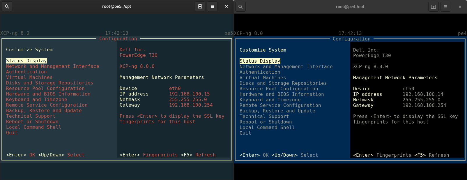
But the xsconsole theme looks like an error occoured (because of the red). I would like to have a more non-error like look. Maybe the outline of the box in white, like here:
-
Sadly, as I said, there is only few "zones" themable.
-
@olivierlambert I think in ten years we don't mind the red or we all still hate it but didn't change

I wonder how long it takes that some coworkers do emergency calls at night because of the color ...
-
Note that red is already the default fallback color so I'm not sure this is a good argument. Also it's exactly the same color than XCP-ng logo, website etc. It's not "red" per se.
-
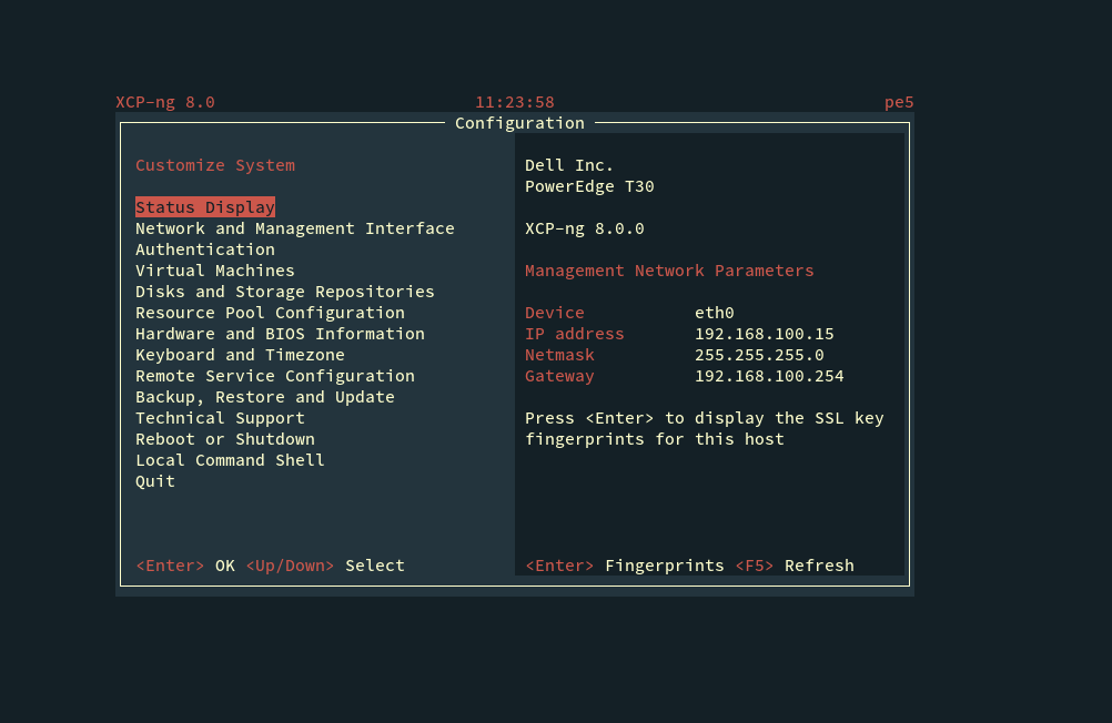
What about this one?
-
@olivierlambert cool

-
-
@olivierlambert Best one!!! Super cool and not ultra left wing red-ish. Thanks.
-
The last example is better from a legible point of view but people with color impairment could still have a problem reading the dark red on grey/black.
And the colors make me think of a boring industry control system from the 1980s.If only the logo colors can be used I would suggest replacing the dark red with the dark yellow in the jet flame.
-
Something like this.
Or possibly changing the light yellow to pure white and using the light yellow instead of the dark one.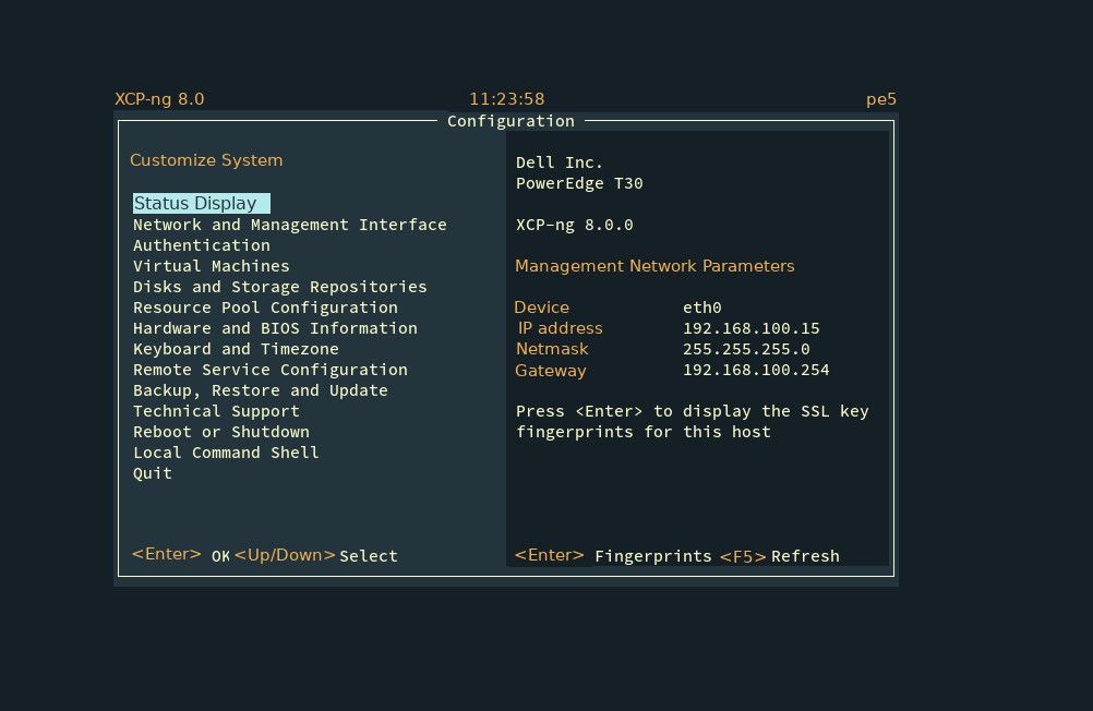
-
@peder We already showed that to a color blind person. No problem at all
 Also the yellow is far from being the main color used everywhere else (website etc.) Thanks for your input!
 -
@peder said in New XCP-ng "theme" in shell:
Something like this.
Or possibly changing the light yellow to pure white and using the light yellow instead of the dark one.Yes, this one is more legible. I like it more

-
@olivierlambert I still think the dark red text is an abomination

Here's another mock-up,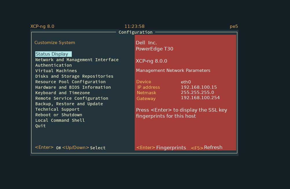 using the darkest red from the logo rocket
 -
I got your point
 That's why the latest design got far less red.